Amdocs – Positive Leadership event in Lisbon, Portugal
A major brand has been re-branded. How did we implement fresh and new brand assets and created the layout and graphic foundation for years to come? It all took place in Lisbon, Portugal.
Once in 2 years it's happening. Amdocs' executives meet in an event that shapes the strategy of the company for the future and we had the privilege of making it smart and beautiful.
The thing is, that the company had just went through a re-branding process and the event is the first outcome and implementation of the new and unfinished guide book. As clear and attractive the guide book is, still, it's not finished and some guidelines are not written all the way up. So, we had to make some decisions and take the responsibility for the new look and feel of the company. The new company logo was a given fact, as well as the colors and the state of mind behind it.
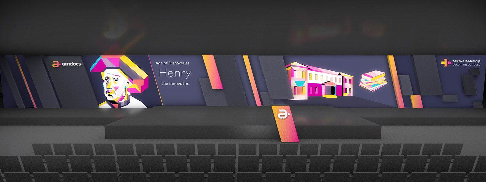
We created the logo for the event which is a fragment of the company's new logo that unveils the plus (positive) sign. The rest of the printing materials were kept as simple as possible for retaining the major change.
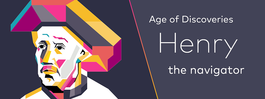
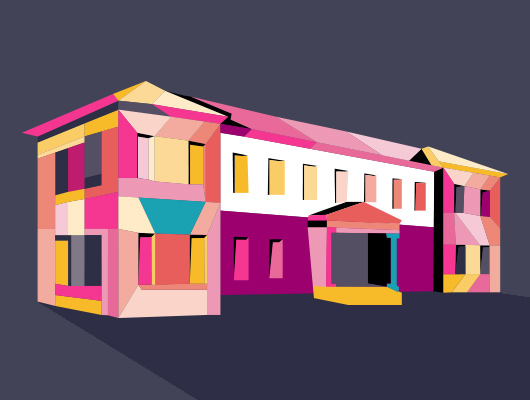
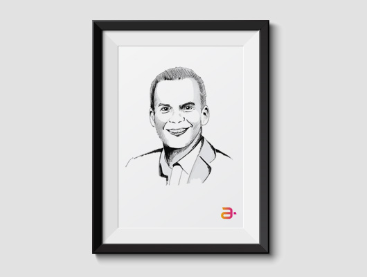
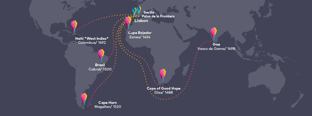
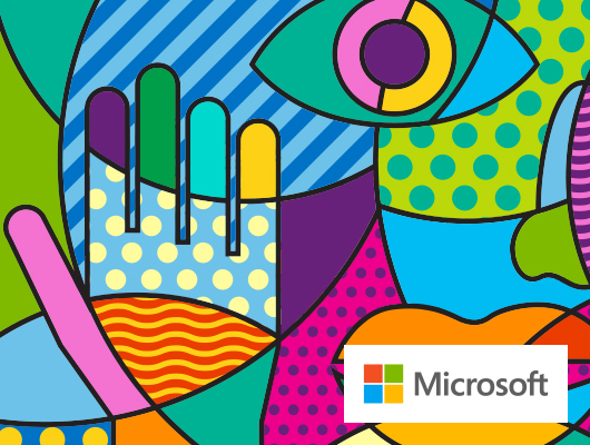
The CEO presentation had to be different. It had to have something extra to emphasize his key points and tell the story as clear and entertaining as it can get. The Wpap illustrating style was the perfect match for us to use, as it captures the story and remain cool, fun and vivid with the massive usage of colors. We never illustrated in the Wpap style, so we did what we usually do when we don’t know how to do something. We became experts at it! We created figures, maps and icons in Wpap style and according to the new guide book 'till we mastered it. The outcome caught everyone by surprise and was a major success.


Amdocs Green
Project
Responsive Website
Deliverables
Creative Concept, Digital Design

CloudX by Mellanox
Project
Brand Identity, Branding Implementations
Deliverables
Creative Concept, Logo Design, Presentation Templates
When Microsoft meet Picasso
Project
Event Branding identity
Deliverables
Creative Concept, Print and Digital Products